
How I Returned To The White Side (And Why It's Okay To Make Mistakes)
When Ella was three, my Clapham based Social Worker mother in law Judith bought her a book called The Okay Book for her birthday. Written by American author Todd Parr, it's a suitably politically correct book that tells you that whatever your life choices, it's all okay. It's okay to be big. It's okay to be small. It's okay to laugh out loud. It's okay to wear a fish on your head. It's okay to eat all the icing on your birthday cake (well, it is if you want to risk hyperactivity, vomit and possible diabetes). You get the picture.
As the years have gone by, as a family we have added to this list. It's okay to give your children McDonalds twice a week. It's okay to tell people you are busy so that you don't have to go out and can lie on the sofa watching Britains Got Talent. It's okay to give your child Calpol to 'aid' their sleep. It's okay to let your children play Rocket League on the PS4 at 6am. It's okay to drink wine every night of the week. It's okay to leave your dog at the school gates in error. Actually, I'm not sure that last one is okay, tbh.
Pink room inspo. Photography by Erin Williamson.
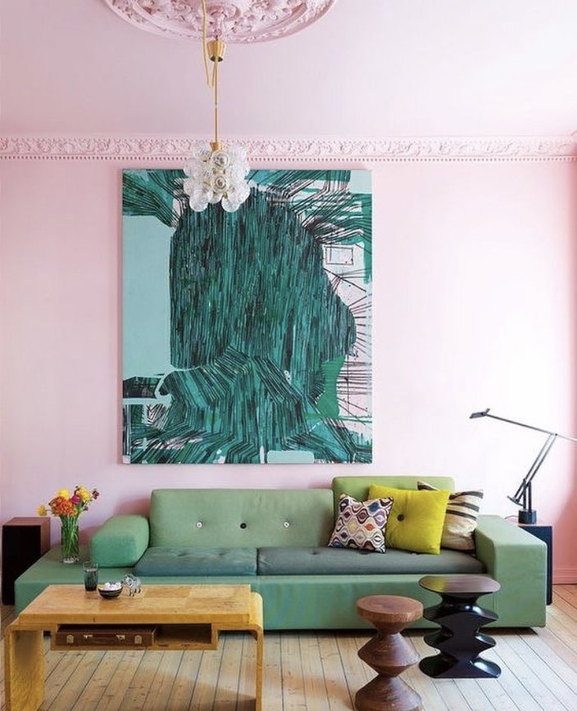
My most recent addition to this litany is that it's okay to make mistakes when it comes to your decor. This came about mostly because of my complete and total obsession with the colours pink and green and my insistence on having this combo in my home. I've been posting inspo pics on Instagram for months and it was getting out of control. So last month, I got out the paintbrush and painted the living room pink. All pink. Not just one wall, not just a touch, not just a nod to the trend. But the whole goddamn room. I quickly realised that this was an error and that it simply didn't work. The main fireplace wall looked brilliant - up went the plate collection and the gold painted IKEA unit with the plants. The colours looked amazing together and it was exactly as I'd planned, everything I had dreamed about. However, the rest of the room looked overdone and, well, overly pink. I had ballsed up. It was a fabulous pink, though. It was Ballerina from French Chic which was my perfect visualised chalk paint colour. I'd just used way too much of it and got carried away.

It's definitely pink. Loved it but a step too far.
I lasted for about two weeks before I gave in and admitted defeat. I couldn't make the room work, the backdrop wasn't neutral and therefore there was way too much going on. It didn't work with the red sofa. My prints didn't gel with it. I'd made a mistake.

Perfection. Photography by Alyssa Rosenheck.
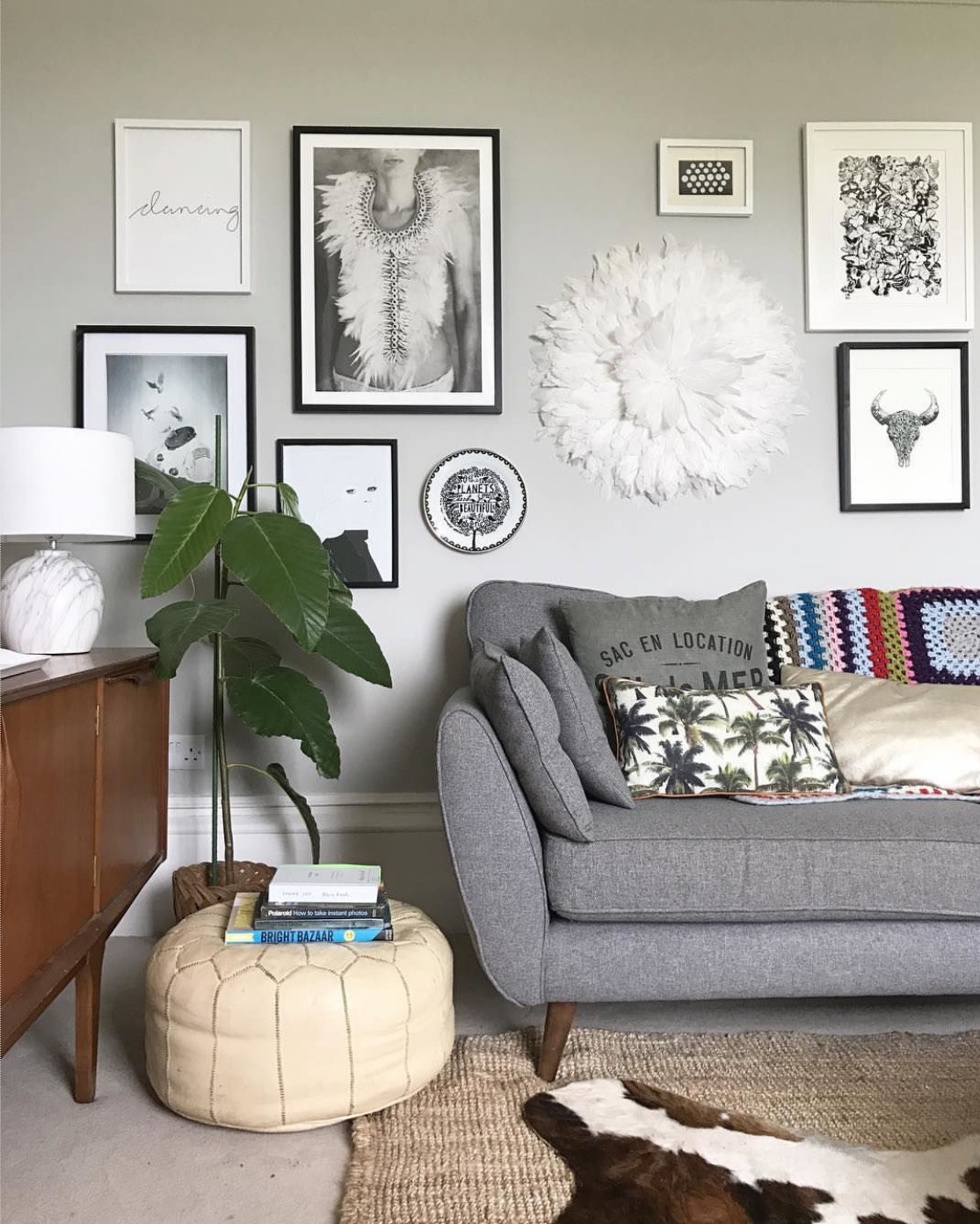
It was during this period of wobbliness that I discovered this picture. The home of Kendall Simmons, an interior designer, artist and traveller from Nashville, it was everything that I wanted in a room. Colour pops, cool art, metallics, texture, greenery. And most of all, it had a neutral white background so all these things worked together in harmony. It simply sung out brightness, lightness, relaxed living and individuality. I quickly realised that I needed to return to my natural white state.
Our previous homes have always been white washed. It's been my signature style, the one thing that has always been consistent in my decor. I've added to the white with wallpaper and accessories and, aside from a shabby chic blip early in the Millennium, it's all been pretty much the same.
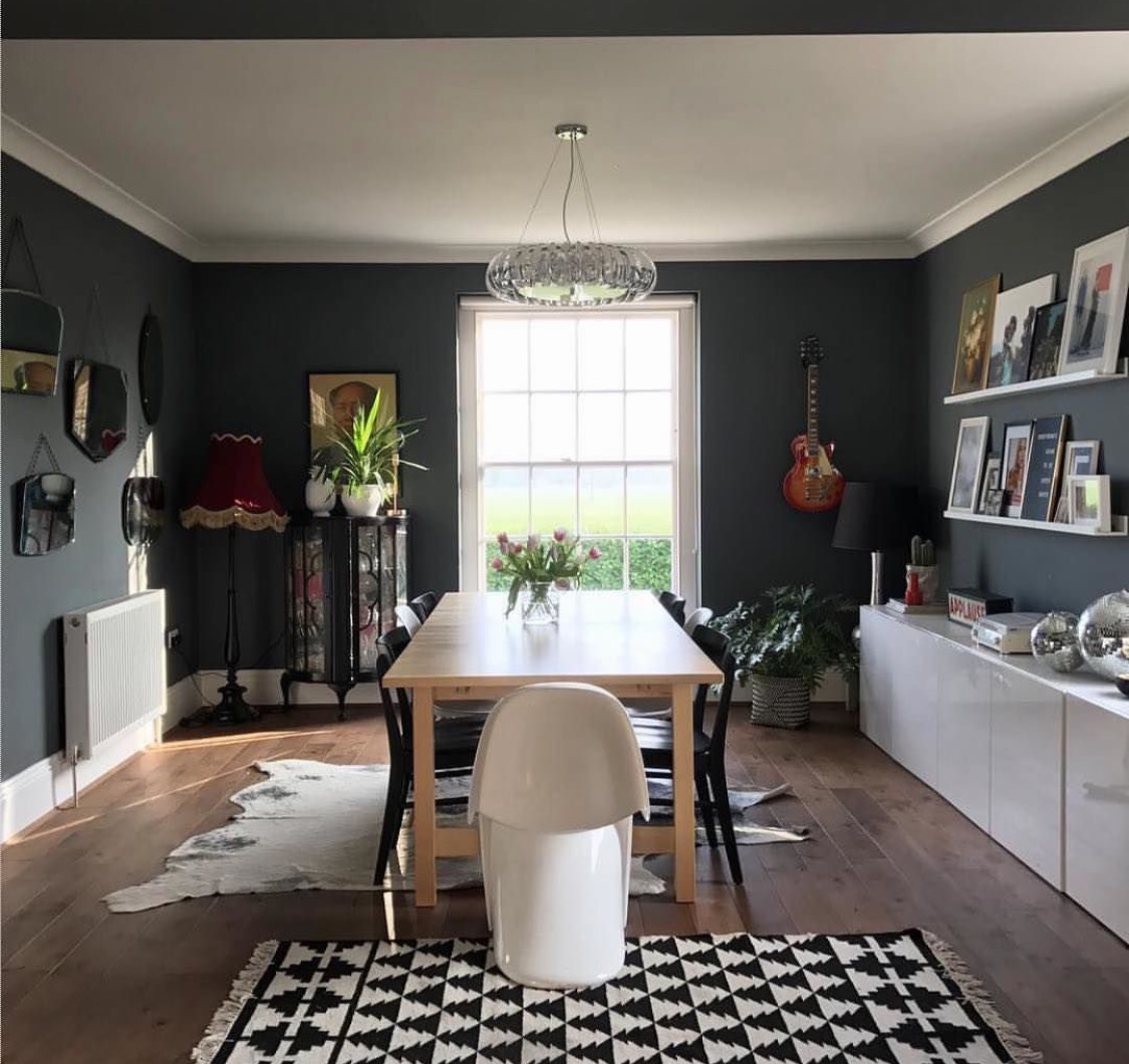
The dark side dining room.
So when we moved in to this house, I decided that it was time to ring in the changes. Heavily influenced by Abigail Ahern and the gloriously decadent and luxurious dark side, I painted my bar sitting room in Farrow & Ball Downpipe. I loved it. Art work looked fabulous against it, greenery colour popped and it felt really glamorous. Fast forward two months later. I suddenly realised that nobody ever sat in this room. Despite the fact that it had a huge TV on the wall (another signature style of the Dawsons), it was empty unless we had people over socialising at the bar. I was still really keen on the colour though, so decided to swap rooms around and made the Downpipe room the dining room. This worked brilliantly for dinner parties - cosy, cocooning, candlelit - but again, I encountered the same problem. If we weren't socialising at the bar or partying, nobody sat in it. The kids wouldn't sit there to do their homework, they found it dark and gloomy. They preferred to sit in the kitchen at the breakfast bar which was hugely irritating as this was a third of the size of the dining table, plus they overtook my kitchen work space with all their school paraphernalia.

My Downpipe bar. Oh, I will miss you.
I realised that I needed to reassess the whole situation. My decision? A return to the white side. I would white wash the whole lot, the Ballerina room and the Downpipe room. Massively excited at the prospect of complete redecoration, I told Joe that I was going to paint the Ballerina room but omitted to tell him that I was going to paint the Downpipe room as I thought the idea of the stress involved might tip him over the edge. As per my previous blog post rule, never tell your partner what you are doing until it's underway. I went to B&Q and bought Primer Quality Valspar Blanc De Blanc, a white that was grey white enough not to make me have to redo the skirting boards and coving, thereby meaning I didn't have any additional work aside from the walls. Perfect.

White room inspo. Designed by the genius Emily Henderson and photography by Laure Joilet.
What I didn't realise in my gungho, let's go for it, attitude was that painting over Downpipe is a JOB OF HELL. If you have ever attempted this yourself, you will understand my trauma. Despite the fact that I bought the best quality paint I could get, it took a full three coats to cover the grey and a full two days to paint two walls. On the remaining two walls, I opted for wallpaper mostly to save the severe stress of doing any more block out coats. I received lots of messages from people during this process recommending products that I should have used prior to commencing the white out, but unfortunately I had already started so it was too late. Note to self: Forward planning and asking people who actually know what they are doing is the key to future success.
This is why I need a neutral backdrop.
The Ballerina room was a different matter. One coat later and it was all done and dusted. I was much sadder to wave goodbye to the pink but realised that I should have thought it through a little more before going all out. I'm not giving up on it though - I've got a chest of drawers that is crying out to be pinked up. Although I absolutely adore the colour, wall wise it doesn't fit with my decorating style.
Which brings me to the point that I have learnt. My decorating style is eclectic. That's being quite kind to myself. I'm a collector, a semi hoarder, a buyer of shite and I love a charity shop haul. In order to be this person and live in an environment that still looks vaguely coordinated, I need a completely neutral backdrop. Now, this doesn't have to be white. The Downpipe was a perfect foil to my vast amount of prints and pictures and general amassed tat - I just couldn't live with it long term. Both white and grey are coordinated to nearly every colour on the spectrum and you can put ANYTHING against them. But I went off piste with the pink and I wasn't able to make it gel with all the other stuff that I needed in my life to make me happy.
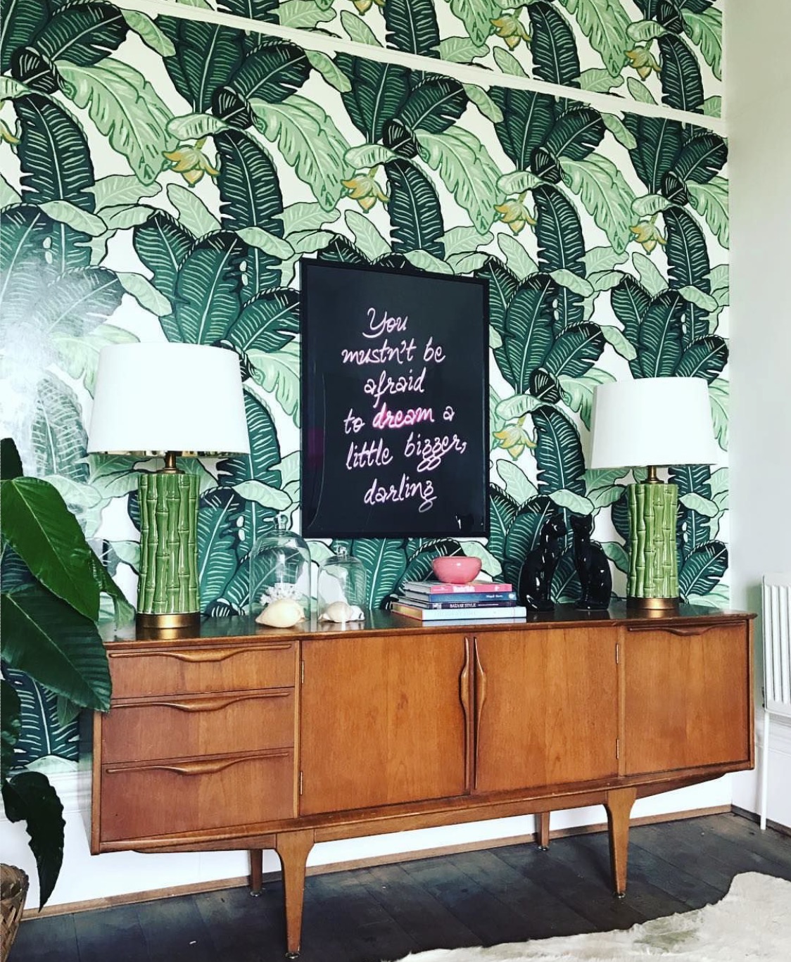
That's what I call a feature wall. Feuiles de Luxe wallpaper from The Loft & Us.
However, I like a bit of an edge to my rooms and that's where wallpaper comes in. I've been obsessed with pattern for years and use it almost as a piece of art in it's own right. I rarely put anything on it aside from the occasional statement print. And for me, that works. I get the serious colour pop from the wallpaper and the white provides the neutral backdrop for my excessive and, let's face it, over the top print and general tat collections. I am the only woman I know who has a flying dolphin, a Lourdes souvenir plate and a goats head from Greece sharing space together on the same wall.
So now I've got two white and wallpapered rooms and I'm feeling just great about it. They're still unfinished, mostly due to the fact that it's the Easter break (it's okay to wish that your kids would go back to school) and there will be blog posts for both revamps coming up soon. I've realised that although dark interiors are glamorous, sultry and cocooning, they're not for me and they don't make my heart sing. Probably because I'm none of these things and therefore they don't suit my personality. I'm definitely more of a light and bright girl and from now on, I'll stick to my niche.

This is my niche and I'm sticking to it.
As I write this, Ella is sitting in the newly white dining room pictured above doing her art homework. A result all round. So long live the White Side. It's definitely 'okay' to say that.